CV colours: Which are the best ones to use on a CV
If you’re unsure whether colour belongs on a CV, you’re not alone. Many job seekers want their application to stand out without looking too distracting. This guide shows you how to choose the best CV colours to make your application look both modern and professional.


Our customers have been hired by: *Foot Note
If you’re unsure whether colour belongs on a CV, you’re not alone. Many job seekers want their application to stand out without looking too distracting. This guide shows you how to choose the best CV colours to make your application look both modern and professional.
Smarter writing with built-in AI
Get instant, high-quality text suggestions tailored to your specific industry.
Choosing the right colour for your CV can make a meaningful difference. When used well, colour helps guide a recruiter’s eye, highlight key information, and make your layout feel polished and modern. When used poorly, it can distract from your experience or make your CV harder to read.
Recruiter eye-tracking research shows that hiring managers spend just 7.4 seconds scanning a CV before deciding whether to keep reading. In that short window, clear structure and good visual hierarchy matter — and colour can support both when applied carefully.
So the real question isn’t simply “Should I use colour?” but “How can colour make my CV easier to read and more relevant to the role I’m applying for?”
In this guide, you’ll learn:
- The best CV colours based on recruiter preferences and colour psychology
- When colour enhances your application — and when to avoid it
- How to choose a colour that suits your industry and level of seniority
- How to use colour strategically without affecting ATS compatibility
Should you use colour on your CV?
Colour can work well on a CV, but only when it’s used with purpose. The right colour can create structure, guide the recruiter to the most important sections and make the CV feel more modern. The wrong colour can look unprofessional or make key information harder to find. The aim is always to use colour to support clarity and professionalism, not just to add decoration for its own sake.
When CV colour helps
Professional colours can:
- Make your CV more scannable, especially in sections such as headings and key details.
- Give your layout a modern feel.
- Highlight important information without overwhelming the page.
- Subtly reflect your professionalism or creativity, depending on the role.
For many job applications, a single accent colour is enough to add clarity and structure without distracting from your achievements.
When CV colours can hold you back
Colour becomes a problem when it:
- Makes the text harder to read.
- Looks overly bright or unprofessional.
- Competes visually with the content.
- Feels out of step with the industry you’re applying to.
If you’re unsure, it’s better to stay subtle. Most employers expect clear, tidy CV formatting first. Colour should support that, not replace it. To summarise:
- Use colour if it improves readability, reinforces your professionalism, or makes your layout easier to navigate.
- Avoid it if it draws attention away from your experience or feels inconsistent with the job you’re applying for.
How to choose the best CV colour

Choosing the right colour for your CV is about selecting a professional colour that feels appropriate for your field and helps your CV look clear and easy to scan. Here are three practical ways to decide which colour works best for your application.
1. Choose a colour based on your industry
Different industries have different expectations for design. A colour that feels creative and modern in one sector may seem out of place in another, so it helps to think about what’s typical and what recruiters are used to seeing.
Creative industries (marketing, design, media, advertising)
- These fields typically expect more visual flair, so you can safely introduce more colours here.
- Subtle yet distinctive accents, such as teal, plum, or muted purple, can help a CV look modern and original without being overwhelming.
People-focused roles (education, healthcare support, social care)
- Softer colours, such as light blue or green, can feel calm, approachable, and well-suited to roles centred on communication and care.
Traditional or corporate sectors (finance, law, government, accountancy)
- Neutral shades like navy, charcoal or black remain the safest choice.
- They project professionalism and keep the focus on achievements and work history.
If the industry is formal and risk-averse, keep your colour choice understated. If it values creativity and ideas, you have more freedom to introduce a bolder accent.
2. Choose a colour based on the organisation you’re applying to
If you’re targeting a specific employer, reviewing their website or branding can help you choose a colour that aligns with their visual style.
You might notice:
- A tech company using teal or dark blue
- A charity using greens or softer tones
- A consultancy preferring deep navy and grey
Choosing an accent colour in the same family can signal cultural awareness and attention to detail, without copying the brand exactly. The aim is to reflect the overall feel subtly. This option is especially useful when you want to tailor your CV to a single organisation.
3. Choose a colour based on the impression you want to create
Colour psychology can help reinforce the qualities you want to highlight. Think about the message you want your CV to send at a glance.
Common associations include:
- Navy → reliable, calm, professional
- Charcoal → modern, confident, serious
- Green → supportive, balanced, linked to wellbeing or sustainability
- Purple (muted) → creative, strategic, thoughtful
- Burgundy → composed, mature, confident
- Pastels → friendly, approachable, people-centred
Best CV colours (based on psychology, recruiter behaviour & industry norms)
Some colours on CVs consistently perform better because they’re easy on the eye and positively perceived by employers. The options below are widely used in successful applications and work well across modern CV layouts.
These recommendations are guided by colour psychology and recruiter behaviour, including eye-tracking research showing that colour should support clear navigation rather than compete with your content.
Here’s what the most effective CV colours say about you and where they work best.
Navy — trustworthy, calm and professional
Navy is one of the safest and most versatile CV colours. In colour psychology, it represents reliability and stability, qualities employers value across many industries.
Best for: IT job applications, healthcare, customer service, administration, and corporate roles.
Why it works:
- Immediately signals professionalism
- Easy to read against a white background
- Suitable for almost every industry
Black & white — timeless, clear, and universally accepted
A classic black-and-white CV remains the standard in more traditional fields. It offers the strongest contrast, making your information quick to scan and ATS-friendly.
Best for: Finance CVs, law, engineering, accountancy, and civil service.
Why it works:
- Professional but less stark than black
- Pairs well with modern layouts
- Helps headings stand out
Dark green — balanced, calm, and reassuring
Dark green is associated with balance, well-being, and growth. It works particularly well in roles centred around support, communication or sustainability.
Best for: HR job applications, education support, environmental roles, non-profits.
Why it works:
- Creates a supportive, grounded impression
- Less traditional than blue but still professional
- Works well for people-focused roles
Muted purple — creative, thoughtful, and distinctive
Deep purples like plum or aubergine convey creativity, ambition, and strategic thinking. When used subtly, they offer a refined alternative to more traditional colours.
Best for: Creative industries, design, marketing, and communication roles.
Why it works:
- Stands out without looking overly bright
- Suggests originality and intention
- Works especially well for portfolios or creative CVs
Avoid bright purple, which can appear informal.
Burgundy or deep red — confident and focused
Deep red tones bring warmth and strength to a CV. Unlike bright red, which can feel overly urgent, burgundy remains controlled and professional.
Best for: Sales CVs, business development, leadership roles.
Why it works:
- Draws attention to key headings
- Conveys energy and confidence
- Works best in small accents
Soft pastels — approachable, warm, and people-centred
Light pastel shades can work well for roles that emphasise empathy or communication. They create a gentle, supportive feel when used sparingly.
Best for: Care roles, early-years education, wellbeing sectors, support work.
Why it works:
- Friendly and approachable tone
- Works well in clean, modern layouts
- Adds personality without overwhelming the page
Use pastels carefully — lighter shades can lose contrast if overused.
CV colours to avoid
Some colours consistently cause issues on CVs because they affect readability or feel too informal.
Avoid:
- Neon shades (distracting, poor contrast)
- Very bright red (can feel aggressive)
- Yellow on white (almost unreadable)
- Clashing colour combinations (reduce clarity)
The 60–30–10 colour rule for a professional CV
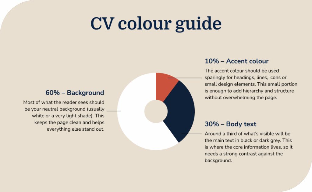
The 60–30–10 rule is a simple design principle that helps you use colour in a clean, balanced and professional way. It removes the guesswork and ensures your CV always looks organised, even if you’re not confident with design.
60% – CV background colour
Around 60% of what the reader sees should be your background colour. In most cases, this should be white or a very light neutral shade. A clean background creates space, improves readability and keeps your CV looking professional across every industry.
30% – Body text
Roughly 30% of your CV is made up of the main text. This should always be black or a dark grey to maintain strong contrast. Dark text on a light background is the most readable combination and is also the safest choice for ATS scanning.
10% – Accent colour
The final 10% is your accent colour — the shade you choose to highlight headings, section titles, lines, icons or small design elements. Keeping this to a small, controlled proportion ensures your CV feels modern and polished without letting colour dominate the page.
Here are my recommendations for the accent colour of your CV.
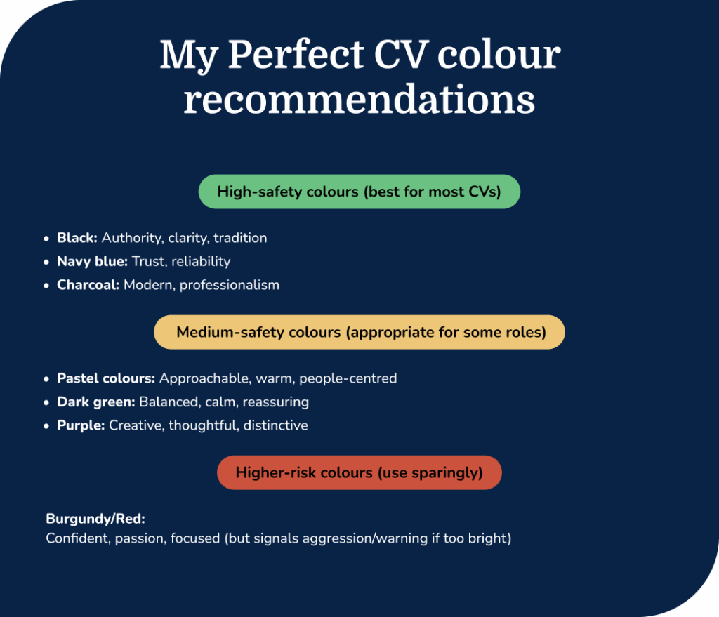
Why this rule works
- It keeps the CV visually balanced and easy to scan.
- It prevents colour from overpowering the content.
- It works across all industries, from corporate roles to creative fields.
- It helps maintain a clear hierarchy, guiding the recruiter’s eye to key areas.
Are coloured CVs ATS-friendly?

Many job seekers worry that using colour will confuse ATS (Applicant Tracking Systems), but modern ATS software reads text, not colour. This means adding a professional accent colour to your headings or section dividers won’t cause your CV to be rejected.
What can cause problems are poor contrast or formatting choices that make the text hard for software and humans to read.
What actually causes ATS issues
To make sure your CV is ATS-friendly, avoid:
- Low-contrast text, such as light grey on white.
- Text inside images or graphics, which ATS can’t read.
- Complex layouts that disrupt the order of your content.
- Decorative elements that don’t add structure.
How to use colour safely with ATS
- Keep your background light and your body text dark.
- Use the accent colour only for headings, lines, or small design details.
- Never place text on patterned or coloured backgrounds that reduce contrast.
- Avoid neon or very bright shades, which can affect readability.
Why clarity matters for both ATS and recruiters
Whether a CV is reviewed by software or a hiring manager, the same principle applies: the text must be easy to scan. A high-contrast, well-structured layout with subtle colour accents helps both systems understand your information quickly.
The easiest way to ensure your CV is ATS-friendly is to use a CV template designed for clarity and compatibility. All My Perfect CV templates follow best-practice formatting and spacing, with the option to choose an accent colour that feels right for your role without affecting how your CV is processed.
Where to use colour on your CV (and where to avoid it)
Colour works best when it helps organise your CV and makes information easier to find. Used in the right places, it can guide the reader’s eye and give your layout a clean, modern feel. Used in the wrong places, it can distract, reduce readability, or look unprofessional.
Here’s where colour adds value and where it’s best avoided.

Best places to use colour on a CV
Headings and section titles
A subtle accent colour on your main headings helps break up the page and makes it easier for recruiters to quickly skim the key sections.
Your name and professional title
A colour accent on your name or job title can create a clear focal point at the top of your CV without overpowering the layout.
Lines, icons and small design details
Simple elements such as horizontal dividers, bullet icons, or sidebar accents are ideal places to introduce a controlled amount of colour.
Sidebars or top banners
A light, clean sidebar or top banner can help structure your CV, provided the contrast remains strong, and the body text is on a white or very light background.
Where to avoid colour
Body text
All main text should stay black or dark grey. This ensures maximum readability and ATS compatibility, especially in longer sections such as work experience.
Large background areas
Blocks of colour behind your text can cause contrast issues and make your CV harder to scan. Full-page coloured backgrounds are best avoided.
Yellow, neon or very pale shades behind text
These reduce legibility, especially when printed or viewed on different screens.
Heavy graphics or decorative elements
Shapes, charts, and visual embellishments can interfere with reading order and ATS parsing. If colour doesn’t add clarity, leave it out.
CV background colours — what works and what doesn’t
The CV’s background plays a significant role in how clear and professional the overall layout feels. While accent colours can be used sparingly, the background should stay clean and neutral to support readability and avoid distracting from your content.
What works
Clean white background
White is the safest and most professional choice. It provides maximum contrast for dark text, keeps your CV easy to scan, and ensures it prints cleanly. It also supports ATS reading, as software extracts text most reliably from solid, light backgrounds.
Very light neutrals
Soft shades such as pale grey, cream, or off-white can work well if they are subtle enough not to affect readability. These tones add a bit of warmth or modern style while still keeping the page clean.
Light sidebars or top banners
A very light coloured sidebar or header can help create structure, as long as the text placed over it remains dark and readable. This approach works particularly well in modern two-column layouts.
What doesn’t work
Full-page coloured backgrounds
Large blocks of colour behind text reduce contrast and make your CV harder to read on screen and in print. They can also cause issues if the CV is converted into another file format during an application process.
Patterns, gradients, or textured backgrounds
Even subtle patterns can interfere with readability and can look unprofessional in more formal industries. Gradients and textures often compress poorly in ATS-friendly formats.
Bright or saturated colours
Strong colours behind text (especially blues, greens, or reds) make scanning difficult and can overwhelm the layout. They also reduce the effectiveness of any accent colours you use elsewhere.
Pastel backgrounds with light text
Pastels may look soft and appealing, but when used as a background, they often result in poor contrast. If a recruiter struggles to read your information at a glance, the colour is working against you.
Common mistakes to avoid with CV colours
Colour can make your CV more engaging and easier to read, but only when it’s used with care. The mistakes below are among the most common reasons a CV can look unprofessional, cluttered, or challenging to read.

- Using too many colours: One accent colour is usually enough. Using multiple shades can make your CV look busy and inconsistent, especially on more formal applications.
- Choosing colours that are too bright: Neon or highly saturated colours tend to dominate the page and can feel informal. They also make headings harder to read and draw attention away from your content.
- Overusing graphics or decorative elements: Coloured shapes, charts, icons, or borders can make a CV feel cluttered and may interfere with how ATS systems read your information. If it doesn’t improve clarity, leave it out.
- Using colour to compensate for weak content: Colour can help structure your CV, but it can’t replace strong experience or clear resume writing. Think of it as a finishing touch, not the foundation.
FAQs about CV colours
What is the best colour for a CV?
Navy, charcoal, and black are the safest and most professional choices for most roles. These colours are easy to read, work in formal and informal industries and create a strong first impression. Muted greens, purples, or pastel colours can also work well when used sparingly and in the right industry.
Does ATS reject colourful CVs?
No. ATS software reads text, not colour. The only issues arise when the text is low-contrast, placed over images or part of a decorative graphic. Keep your body text dark, your background light, and your accent colour subtle, and your CV will remain ATS-friendly.
Should graduates or entry-level candidates use colour?
A small amount of colour can help a graduate CV look modern and organised. Stick to one calm, professional accent colour so your layout feels polished without overshadowing your experience.
What CV colour stands out most to recruiters?
Colours don’t need to be bold to make an impact. Navy and charcoal consistently perform well because they create a clean, structured layout that’s quick to scan. Recruiters respond more to clarity than to bright colours.
What’s the worst colour to use on a CV?
Bright red is one of the riskiest colours because it’s strongly associated with warnings or urgency. It can easily dominate the page and distract from your experience.
Other colours to avoid include:
- Neon shades (neon green, neon yellow, neon pink) — very hard to read on screen and in print.
- Yellow — especially on a white background, as it offers almost no contrast.
- Lime green — tends to look informal and can clash with most layouts.
- Hot pink or bright magenta — often seen as playful rather than professional
- Bright orange — can draw too much attention and feel overwhelming.
- Very light pastels used for text — they disappear against a white background.
- Deep purple + navy combinations — can blend together and reduce readability.
Final thoughts
A well-chosen CV colour can help your application look clear, modern and professional. The key is to keep your layout easy to read, use colour sparingly, and choose a shade that suits the role and industry.
If you want a simple way to get this right, our CV builder makes it easy. All My Perfect CV templates are ATS-friendly, follow the recommended 60–30–10 colour rule, and let you switch between different colours in seconds. This means you can explore several options and instantly see which one feels right — without risking readability or professionalism.

Andrew Smith
Senior Content Writer
Meet Andrew Smith – an accomplished English copywriter with a strong background in SEO optimisation. Passionate about producing engaging content, Andrew has written across various fields, including health and fitness, security, travel, and tourism.
*The names and logos of the companies referred to above are all trademarks of their respective holders. Unless specifically stated otherwise, such references are not intended to imply any affiliation or association with myperfectCV.
