Best Font for a CV
Choose the best font for CV to boost professional readability. Use expert typefaces and sizes to make your application stand out and land more interviews.


Our customers have been hired by: *Foot Note
There are around half a million fonts to peruse – enough to frighten the most enthusiastic typographers. However, only a handful are appropriate for CVs. Confused? We’ve created a comprehensive guide explaining everything you need to know about the best (and worst) fonts for writing a CV. With our help, you’ll make an excellent first impression and secure that all-important interview!
Smarter writing with built-in AI
Get instant, high-quality text suggestions tailored to your specific industry.
What is the best font to use on a CV?
Fonts are far from trivial. It doesn’t matter how you describe yourself on a CV if the hiring manager can’t read it. On top of this, choosing the best CV font can influence the reader’s mood. Clean typefaces invoke professionalism, whereas whimsical scripts are romantic.
So, what’s the best font for a CV? There are several options to choose from, depending on your personality. Our top advice? Your application should only be one to two pages long. We advise playing around with different scripts because some take up more space than others.
Before listing our top suggestions, it’s helpful to understand the difference between two of the most popular font families: sans and sans-serif.
Sans vs sans-serif fonts
There are several font families, but sans and sans-serif are typically used for CVs and professional correspondence. The main distinction between the two is the presence or absence of serifs – decorative lines or tails within the letters. Both exude professionalism but say different things about your personality.
Serif fonts
Serif fonts have a more established feel and are often used in print media, such as newspapers, books and magazines. The subtle embellishment and sophisticated shapes reiterate your trustworthiness and reliability. We suggest using a sans-serif typeface in the following industries: finance, law, medicine, business, and civil service.
Some of our favourite serif fonts include:
- Times New Roman
- Georgia
- Cambria
- Garamond
Sans-serif fonts
Sans-serif fonts ditch the stylistic swirls for symmetrical lines. Steering away from tradition, they’re perfect if you want to give off a modern vibe to the hiring manager. Plus, they tend to be easier to read online. We suggest using a sans-serif typeface in the following industries: marketing, design, fashion, IT, and advertising.
Some of our favourite serif fonts include:
- Arial
- Calibri
- Helvetica
- Tahoma
- Trebuchet
- Century Gothic
Check the subtle changes in the same CV written in different fonts.
CV example in Times New Roman
CV example in Georgia
CV example in Trebuchet MS
CV example in Tahoma


Does your CV font even matter?
Between job hunting, crafting compelling content, and refining your presentation, choosing the right CV font is probably the last thing on your mind. But don't be fooled – selecting a professional script is one of the secrets to success. Unconvinced? Let's take a closer look at some of the benefits.
Maximises readability
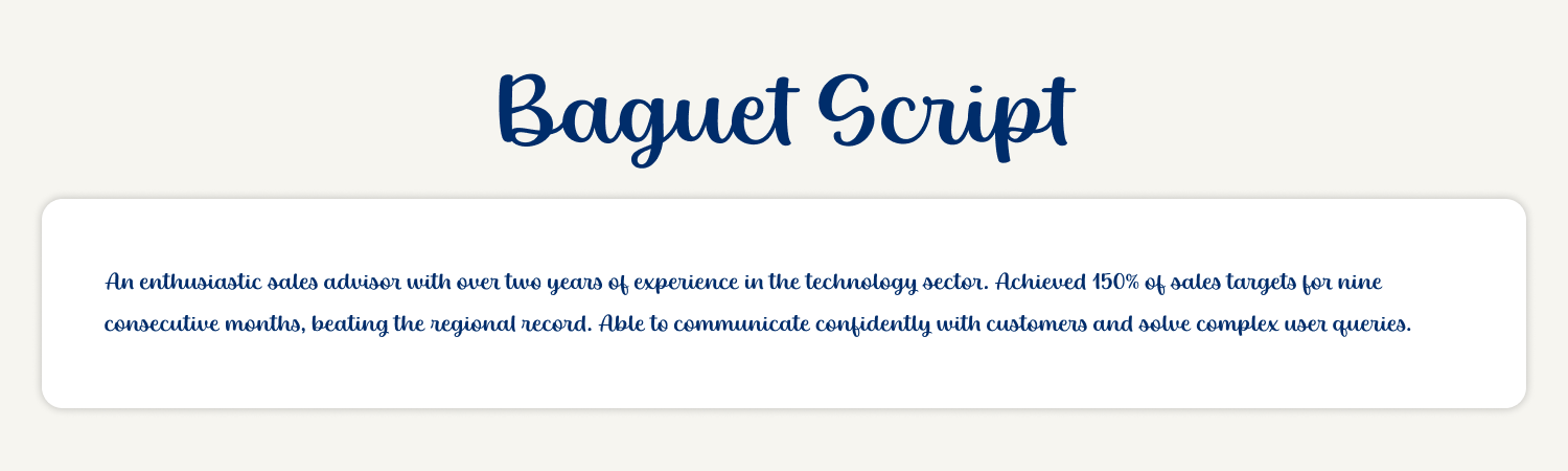
The best fonts for a CV maximise readability. There's no need to overcomplicate the design. Instead, choose something simple, easy to follow, and universally accepted. While wacky scripts might seem like a good idea, they're usually difficult to read. You don't want to give the hiring manager a headache before they've reached the meat of your application!
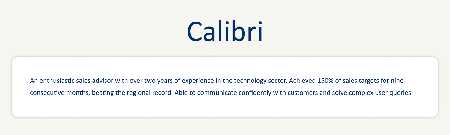
Calibri in 12 point size is one of the most popular CV fonts. Let's compare it to Baguet Script – a fun and flashy brush script. Which is easier to read?
OR
Establishes your professionalism
Although professionalism is subjective, it’s best to take a formal approach to CV writing. We suggest selecting a script that shows some level of seriousness. Otherwise, the hiring manager might think you’re too immature for the position.
What about creative industries? We recommend sticking to a tried and tested typeface. Instead of going rogue with your CV font, you can make your application more visually interesting by experimenting with different CV structures and formatting tools.
Easier to scan for ATS software
More and more companies are using ATS software to sift through CVs and identify the best candidates. As such, you must choose a scannable typeface that accentuates relevant keywords and phrases. Luckily, most fonts are ATS-friendly. However, there are a few things you want to avoid.
Steer clear of custom fonts you can download from the internet. Chances are the recipient won’t have the same one installed, meaning your CV will be completely unreadable on their computer. Plus, be wary of typefaces with special characters – similar to old-school MSN bios (sorry if we’ve brought up any lingering embarrassment). For example:
คຖ ēຖthนŞiคŞti¢ ŞคlēŞ ค໓งiŞ໐r ຟith tຟ໐ ฯēคrŞ ໐f ēxpēriēຖ¢ē iຖ thē tē¢hຖ໐l໐ງฯ Şē¢t໐r.
10 of the best fonts for a CV
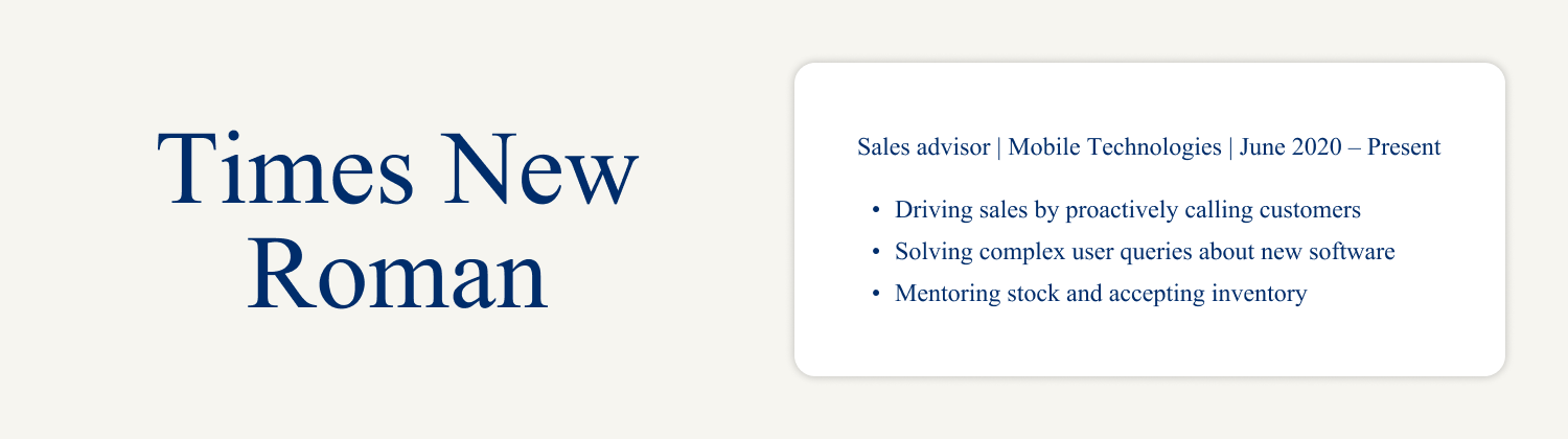
Times New Roman
Times New Roman is one of the most popular CV fonts. It reigned supreme as Microsoft's default text for many years, although it was ousted by Calibri in 2007. Its old-style characteristics and traditional feel make it a popular choice for management positions, where candidates must demonstrate credibility with lots of CV skills.
However, anything below 12 points in size isn't particularly legible. Remember to adjust the font size so hiring managers can easily scan through your information. Check out the example below:
Georgia
Although sans-serif fonts typically look more modern, Georgia is the exception. It offers the best of both worlds, expertly blending contemporary and classic influences. The designers managed to create something elegant but legible when printed on low-resolution screens.
Many newspapers use Georgia to appeal to older and younger audiences, and it's ubiquitous in the writing and editorial industries. Check out the example below:

Cambria
Struggling to squeeze all your CV sections onto one or two pages? Cambria might be the solution. It's clear and easy to read in small sizes. Plus, it was designed for on-screen reading. Typographers often describe it as a slightly less formal version of Times New Roman. Check out the example below:

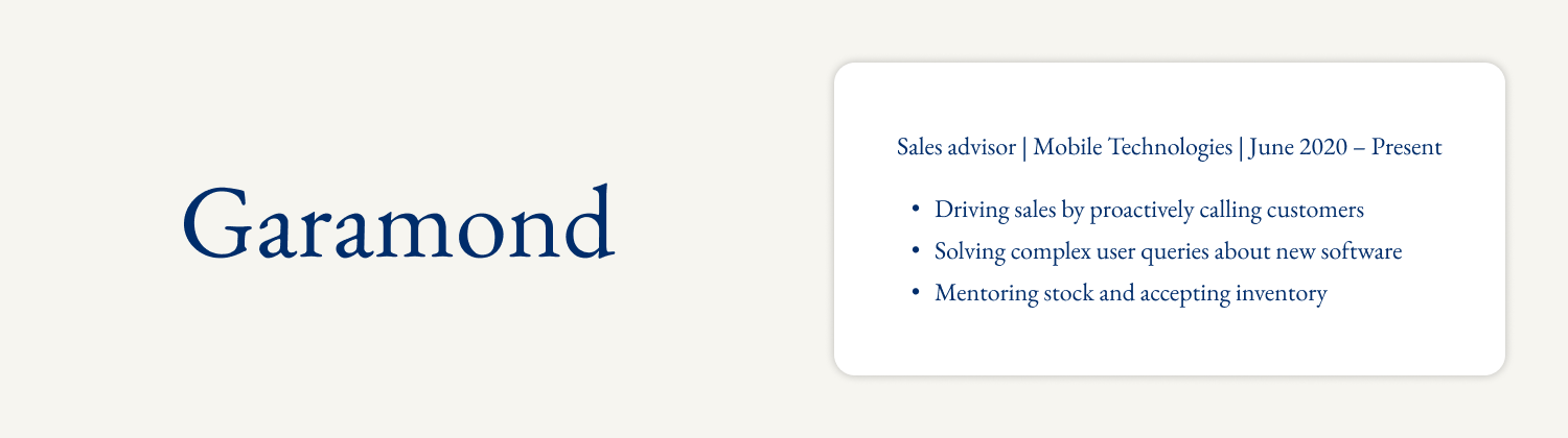
Garamond
Garamond injects CVs with some much-needed character without straying too far off the beaten track. Arguably, it's the most modern serif font, despite an organic structure resembling quill and ink handwriting.
While the font is beautiful, it was initially designed for print media, meaning it's not always well-adapted to screens. If you want to use it, always ensure the text is large enough. Check out the example below:
Arial
Arial is a simple, no-frills font that's easy to read and crisp across devices. It doesn't matter whether the hiring manager is reading a paper CV or an online application because the smooth shapes and terminal strokes are always pleasing to the eye. Perhaps the most versatile of all typefaces, you can use Arial across sectors, from finance to advertising. Check out the example below:

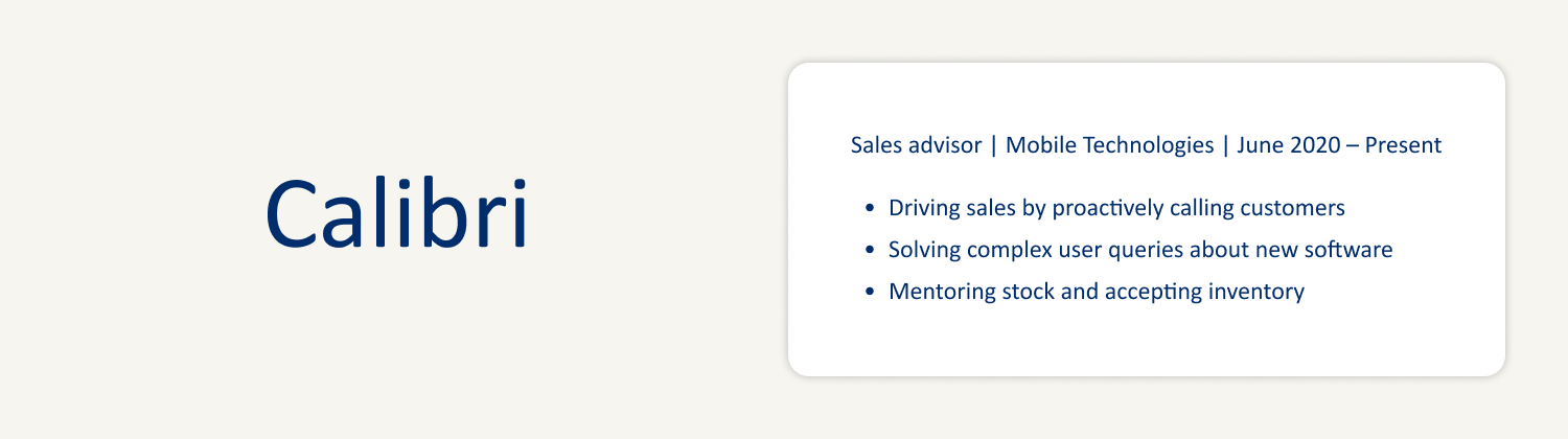
Calibri
Calibri stole the crown off Times New Roman and is now the king of CV fonts. Subtle roundings on stems and corners provide an air of informality, while the light letters offer respite from detail-heavy CVs. Moreover, the narrow proportions can save you bundles of space without compromising readability. Check out the example below:
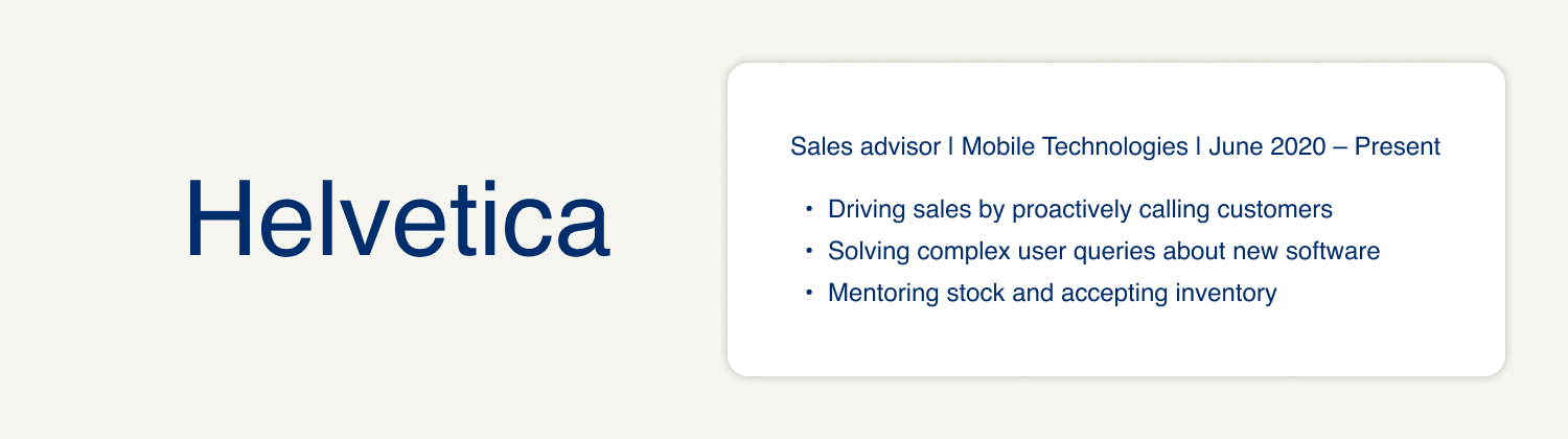
Helvetica
Helvetica is one of the world's most famous fonts and represents the very best of Swiss typography. The crowning feature? It's highly functional. There are no fancy flourishes or emotive elements – just crystal-clear information. This uncompromising clarity makes it a popular choice for corporate logos, such as Microsoft, Mitsubishi Electric, and Motorola. Check out the example below:
Tahoma
Tahoma is one of Microsoft's newer sans-serif fonts, and perhaps one of the quirkiest – some even compare it to the often-mocked Comic Sans (which is definitely inappropriate for a CV). However, don't let this scare you. While slightly rigid, the letters are friendly-looking with just enough curvature to flow cohesively. Check out the example below:

Trebuchet
Trebuchet is a wild card and not as common as the other fonts on this list. Nevertheless, it's undeniably striking with large, dark letters and geometric lines. The strong and unmistakable shapes jump off the page, immediately catching the reader's attention. Thanks to its online accessibility, it's quickly become a classic choice for web page design. Check out the example below:

Century Gothic
Century Gothic draws inspiration from the geometric-style sans-serif typefaces popular during the 1920s and 1930s. Rounded letters and symmetrical lines boost visibility, so it's perfect for everything from the headline at the start of your CV to small qualities of text. Check out the example below:

What kind of font is inappropriate for a CV?
We know what you're thinking – how can I stand out if I don't use a unique CV font? However, resist the temptation to stray too far outside the lines. Remember, readability matters more than picking something fun and different.
Heavily stylised fonts
Heavily stylised fonts definitely make an impression, but they're more appropriate for posters, t-shirts, and logos. Some are spindly and cursive – think elaborate brush scripts like Brush Script MT and Edwardian Script ICT. Others are Art Deco inspired with thick, heavy letters. Broadway is a popular option outside CV writing, but looks clumsy on job applications:
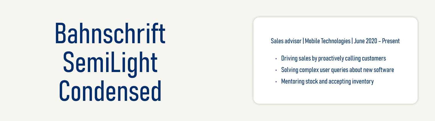
Narrow fonts
You might think ultra-narrow fonts would be a good choice for your CV, especially if you have a lot of detail to cover. Yes, they save space, but they also look cramped. It's better to choose a recruiter-approved font that's readable at a smaller size than a squished-together script. Look what happens when we use Bahnschrift SemiLight Condensed:

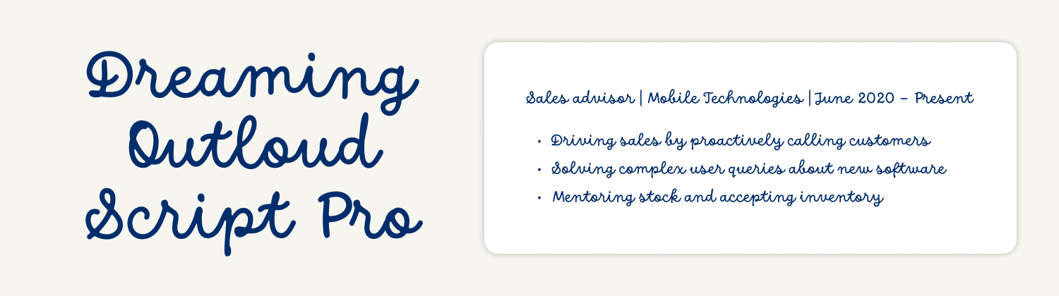
Custom and jokey fonts
We've already touched upon custom fonts, but it's worth reiterating. At best, downloadable scripts and special characters look childish. At worst, they don't always translate across computers. There's no point in work experience CV section, for example, if nobody can read it.
Similarly, jokey typefaces aren't appropriate. Far from revealing your creative side, they'll only irritate the reader and derail your chances of receiving an interview invite. Take Dreaming Outland Script Pro as an example:
Font size for a CV
What size font should a CV be? It really depends on the font itself. For instance, Times New Roman is barely readable under 12 points, whereas Century Gothic looks clear and crisp at 10 points. Somewhere between 11 and 12 points is best for body text.
As for headings, they should be a little larger to guide the reader through your sections – 14 to 16 points is enough to signpost crucial information. On the other hand, you don’t need to draw attention to non-essential details, like dates for your education section and notes about references. Here, you could use a 10-point font to save space.
Font formatting for a CV
Instead of going off the rails with your CV font, we recommend using formatting tools to make your application more engaging. Alongside emphasising important details, bolding, italicising, and underscoring convey passion and enthusiasm. Our top feedback is to stay consistent and use these tools sparingly – less is more if you want to ignite the employer’s interest.
Italicising
Italics are one of the most common CV formatting tools because they’re easy to separate and read. Some candidates use them to denote official publications, employers, and governing bodies. Others italicise text in brackets, such as dates of employment. For instance:
Senior journalist | The New York Times (June 2020 – Present)
OR
Senior journalist | The New York Times | June 2020 – Present
Bolding
Bolding text draws attention to certain keywords and phrases. Candidates usually bold their name, contact information, and section headings. However, you can also use it to emphasise specific strengths or achievements within the body text. Like italics, don’t overdo it – otherwise, you’ll end up with a messy lump of content. Here’s how you could incorporate bolding in the main text, specifically the personal statement:
A diligent journalist with ten years of experience working for globally renowned newspapers. Researched and published 100 articles for the digital platform, amassing 100,000 new memberships. Specialisms include global sports events and athlete profiles.
Underlining
Underlining has lost popularity since the rise of professional, best CV formats. Nowadays, these templates break up large chunks of text with spacing and clever word processing options. With that said, you could still underline headings if you’ve included bundles of information and want to ensure separation. It might look something like this:
Work history
Journalist | The New York Times | June 2020 – Present
CAPITALISING
Capitalising is only appropriate for drawing attention to CV headings. In almost every other case, it looks a bit shouty. You wouldn’t want to scare the hiring manager off before they’ve had the pleasure of meeting you. For example:
WORK HISTORY
Journalist | The New York Times | June 2020 – Present
Coloured text
It’s enough to give you a migraine, isn’t it? There’s absolutely no need to type in a different coloured text – not for headings, contact information, or keywords. Although your inner Bob Ross might be reeling, your CV isn’t a piece of creative writing. Always use a black font on a white background.
Highlighting
Like coloured text, highlighting is often more distracting than useful. You might have seen some hiring managers mark CVs, but this is more for their personal notes. Bolding or italicising text is impactful enough, so there’s no reason to whip out your STAEDTLER.
Bullet pointing
We’ve left the best till last – bullet pointing. This essential formatting tool breaks up large paragraphs of text, so the reader doesn’t feel overwhelmed. As well as improving the flow, lists look cleaner than chunks of unbroken content. The most obvious place to use them is in the work history section:
Journalist | The New York Times | June 2020 – Present
- Wrote over 100 well-researched articles over two years
- Managed a team of 30 journalists around the globe
- Amassed over 100,000 new memberships to the newspaper’s digital platform
Tips for choosing the best font styles and formats
Don’t overcomplicate things
Simplicity is key when choosing the best font for a CV. Instead of overcomplicating things, stick to recruiter-recommended typefaces, such as Calibri, Arial, and Times New Roman. If you want to make your content more engaging, experiment with formatting tools and add plenty of positive adjectives and action verbs.
Find the right CV format to complement your font
If you’ve chosen a traditional reverse-chronological structure, you might want to stick to a serif font that mirrors the professionalism. Perhaps, you’ve opted for a creative template? Sans-serif fonts are perfect because they’re informal and fun. Also, think about the industry you’re applying for – some sectors, such as finance and law, prefer formal typefaces, whereas others give you a little more leeway.
Don’t forget about your content
Ultimately, content is king. Don’t let the font distract you from creating awesome sections that prove why you’re the best person for the job. If you need more advice on what information to include, read through the best CV examples on our website.
Key takeaways for CV fonts and sizes
Choosing the right font doesn’t have to be difficult. Simply follow our expert advice and ensure the typeface reflects your industry and personality. Most importantly, don’t be too creative – always prioritise readability.
Ready to write your CV? Take advantage of the other helpful resources on our website, including our pre-made CV templates and job-specific CV examples.
Jagoda Jaskowicz
Senior Content Editor, Translator
Related Content


*The names and logos of the companies referred to above are all trademarks of their respective holders. Unless specifically stated otherwise, such references are not intended to imply any affiliation or association with myperfectCV.